

Clear messaging for new way to invest in real estate.
About
Aiooki is a mid stage real estate startup that helps investors co-invest in properties at a lower amount than traditional real estate. Their initial website did not clearly communicate this value nor did it inspire trust and confidence. The project involved getting to know the client's unique value and understanding the real estate space prior to diving into solutions.

Scope: Our task was to redesign Aiooki’s responsive website to better convey their message and compel visitors to get started by clicking on the CTA.
Role: Our team had 5 members and I was an individual contributor across all phases including discovery, usability testing, interview scripting, information architecture, sitemap, visual layout & design
Messaging
building trust through understanding
Research revealed a gap in trust that was preventing users from taking the next step. I researched the components to understand how it is cultivated and we focused surfacing those qualities including:
Relatability
Credibility
Transparency
Benefit
Below are before and after screens illustrating how we changed the architecture to drive trust through relatabilty and transparency to help users connect with the brand.
Homepage Before
No sense of the core values and who Aiooki is
Page by page walk through
Language speaks of platform and process
Description of how it works provides little detail
homepage After
Clear mission and beliefs add meaning
More above the fold to solicit scrolling
A brief origin story lends depth
Surfacing how Aiooki works with clear explanations
Visually providing specific information to motivate visitors.
The page listing content - specific opportunities to investors was key to sharing how Aiooki delivers value.working in collaboration with a content strategist, we highlighted immediate opportunities and what it would take to participate.
Before
Stock photos, no specifics.
No sense of what properties one can invest in
Lack of detail and depth on opportunities
No sense of time horizon
After
Specific properites and facts listed
Depth of information explained visually
Percent pledged compels urgency
Clear call-to-action
conversion through inspiring trust and security
What happened once visitors clicked on the call-to-action was key to conversion. We made the experience work no matter where the user clicked, and prviced a deeper level of trust once there to dissolve barriers to submitting personal information.
Before
Messaging is stand-offish and exclusive
Mailing list sign-up only
No apparent way to come back to check status
No password security
after
Modal pop-over can appear on any page
Messaging is open, welcoming, inviting
Feeling that by creating an account, a door will open to next steps
Security features to inspire trust

Information Architecture & Site Map
To help us understand the site structure, I laid out an initial site map within a rough wireframe.
Don't debate, validate!
A/B Testing
Our team was having an internal debate about which of 2 options would perform better and went to Usability Hub to settle the debate with a clear winner emerging.
Option 1 - Winner!
Option 2


Visual Design
Typography & Grid Systems
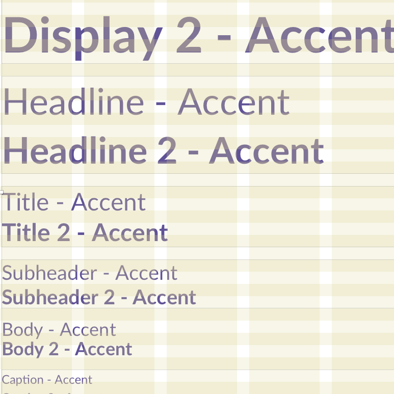
I created the initial foundation for the fonts and type scales to be standard across the site. Then I used the type sizes to drive a horizontal and vertical grid system to build the site on.
Typography Specifications
Spacing Grid

Responsive Design
We converted the pages to 3 different formats to communicate how the site responded on different device sizes.

Conclusions
Content strategy and copywriting need to work together to convey the most important aspect for this site - trust. Without trust as a foundation, the best information architecture and visual design is meaningless.
Learnings
How much a layout grid can help create a polished design.
The full rigor needed to spec a detailed website design.
The emphasized importance of content rather than site structure to drive improvement.
Do differently next time
Start with a style guide and system earlier in the process.
Work with the design across different platforms at the same time.
Mobile First!
Acknowledgment
A special thank you to the Aiooki team for making it all come together:
Brian Yang
Szu Chen
Kate Bennet
Jane Hainze