

Reducing the friction of applying for life insurance.
About
Simple Disability provides a platform to connect a massive unaddressed audience with disability and life insurance. With required data from applicants, the platform could solicit approval from underwriters within minutes.

Scope: My client Simple Disability was an early stage insure-tech start-up. The objective was to create a frictionless application path to approval and payment. The experience needed to be fast and reduce errors for accurate underwriting.
Platform: Initially, Simple Disability wanted to create a desktop web application. I realized it was possible to do on mobile, and convinced the client to adopt a mobile first approach.
My Role: As Lead UX Consultant on the 5 person team, I drove user research, information architecture, copywriting, prototyping and visual design specification.

Understand
Understanding the user
In the cafeteria, I took an informal survey of how folks would feel before beginning this task. The negative feelings far outweighed the positive.
“The form is a barrier to what people really want to do...”
Iteration
After an inventory of the fields to be included I defined a type for each. Now with a solid content foundation, I began exploring ideas for how the form could be as painless as possible.
Usability Preference Testing
The iterations distilled down into 2 core flows for the form and each had its assumed merits. I conducted usability testing with 6 users from our target demographic including:
Remote testing
Interview script writing
Online surveys
Prototype creation
User recruiting & scheduling
Data synthesis
Responses compiled by user.
Hypothesis
We believe that more users will feel compelled to complete the form with the architecture having individual pages for each question - Version 2.
Success Metric
4 out of 5 users will indicate they prefer Version 2 with an aggregate ranking at least 10 points higher than Version 1.
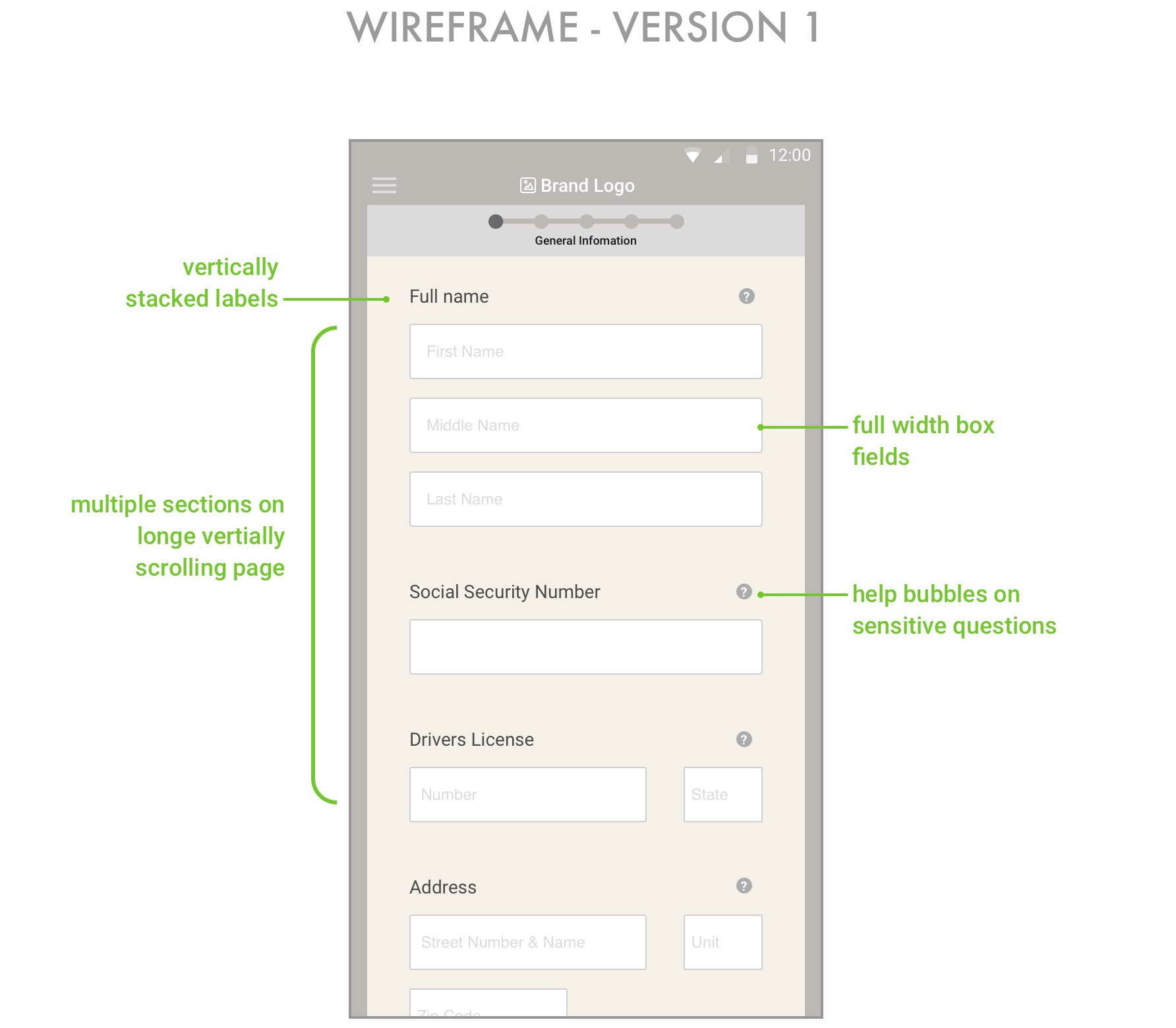
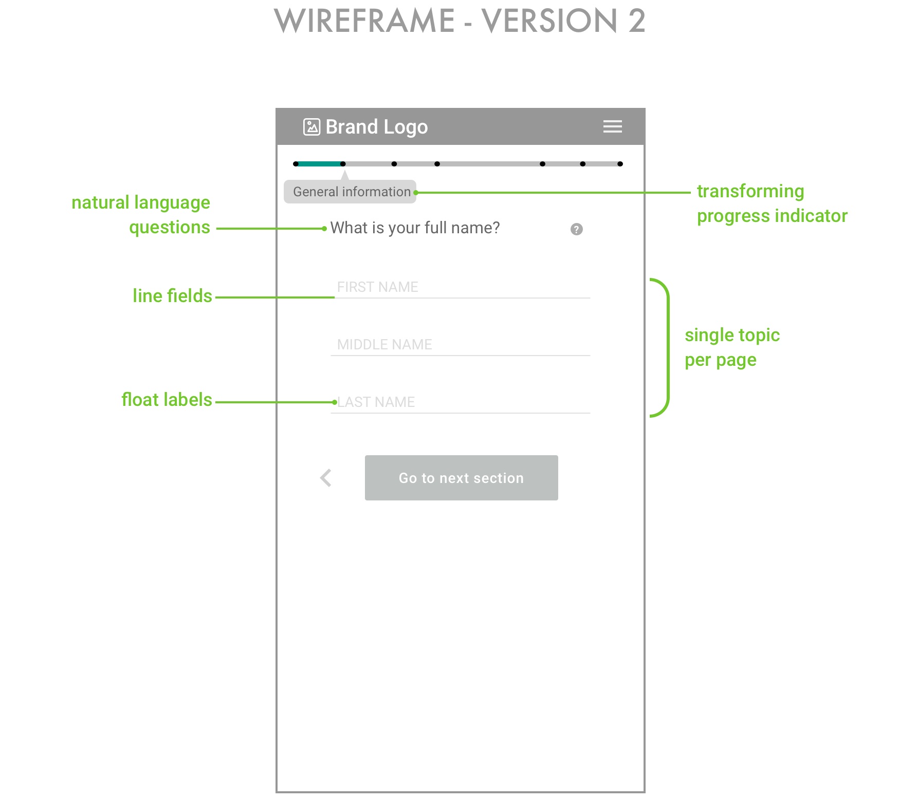
Version 1
Within a topic, the user is presented with one question per page.
Version 2
For each section a long continuous scroll with all questions grouped by topic.
Hypothesis Invalidated
More users preferred the Version 2 citing that it felt shorter, easier and faster, and all users found the application to be simple, easy and painless.
Aggregation of responses across users for each version.
“A lot simpler than I thought it would be. The questions were not overwhelming and I felt comfortable answering them”
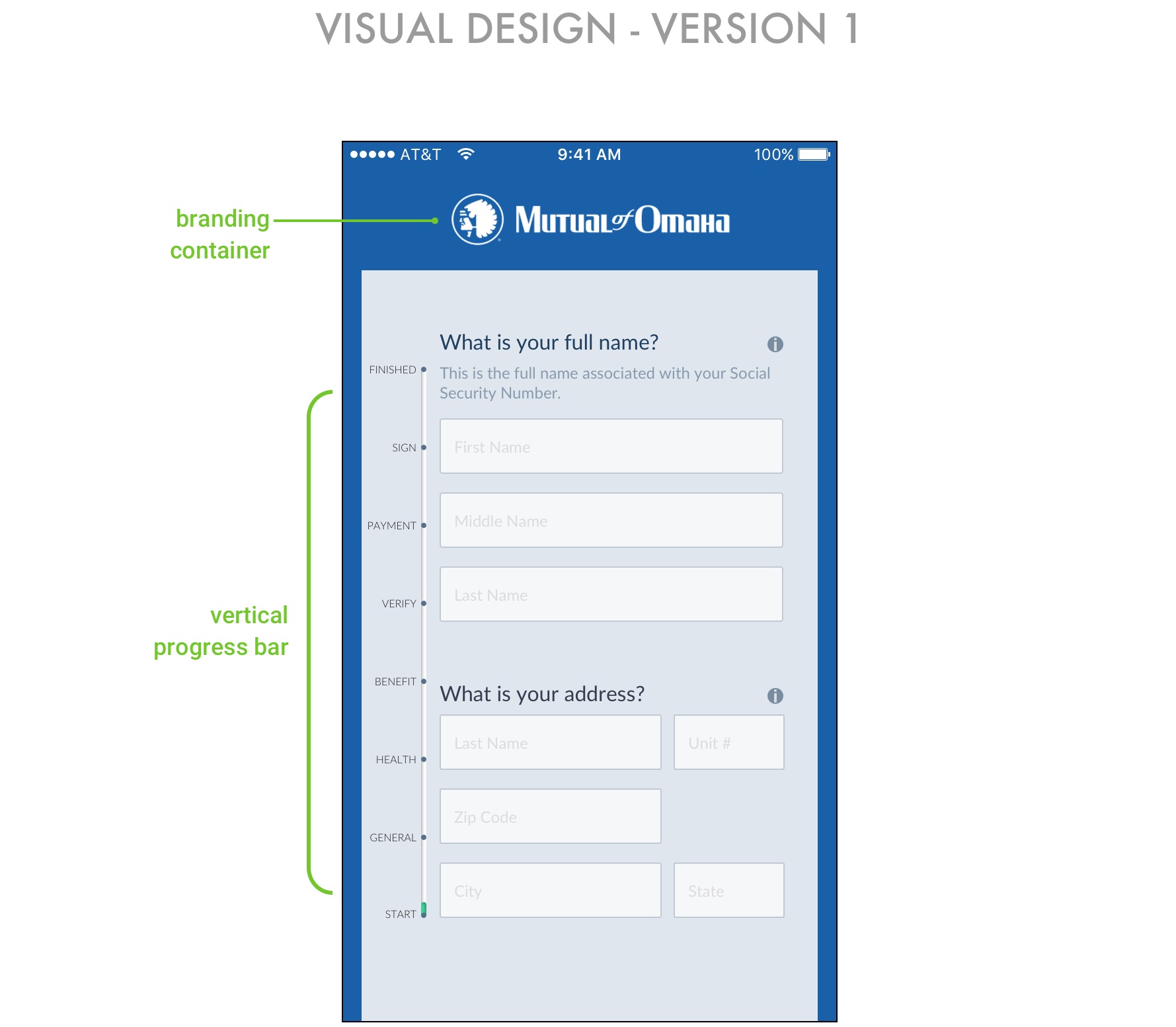
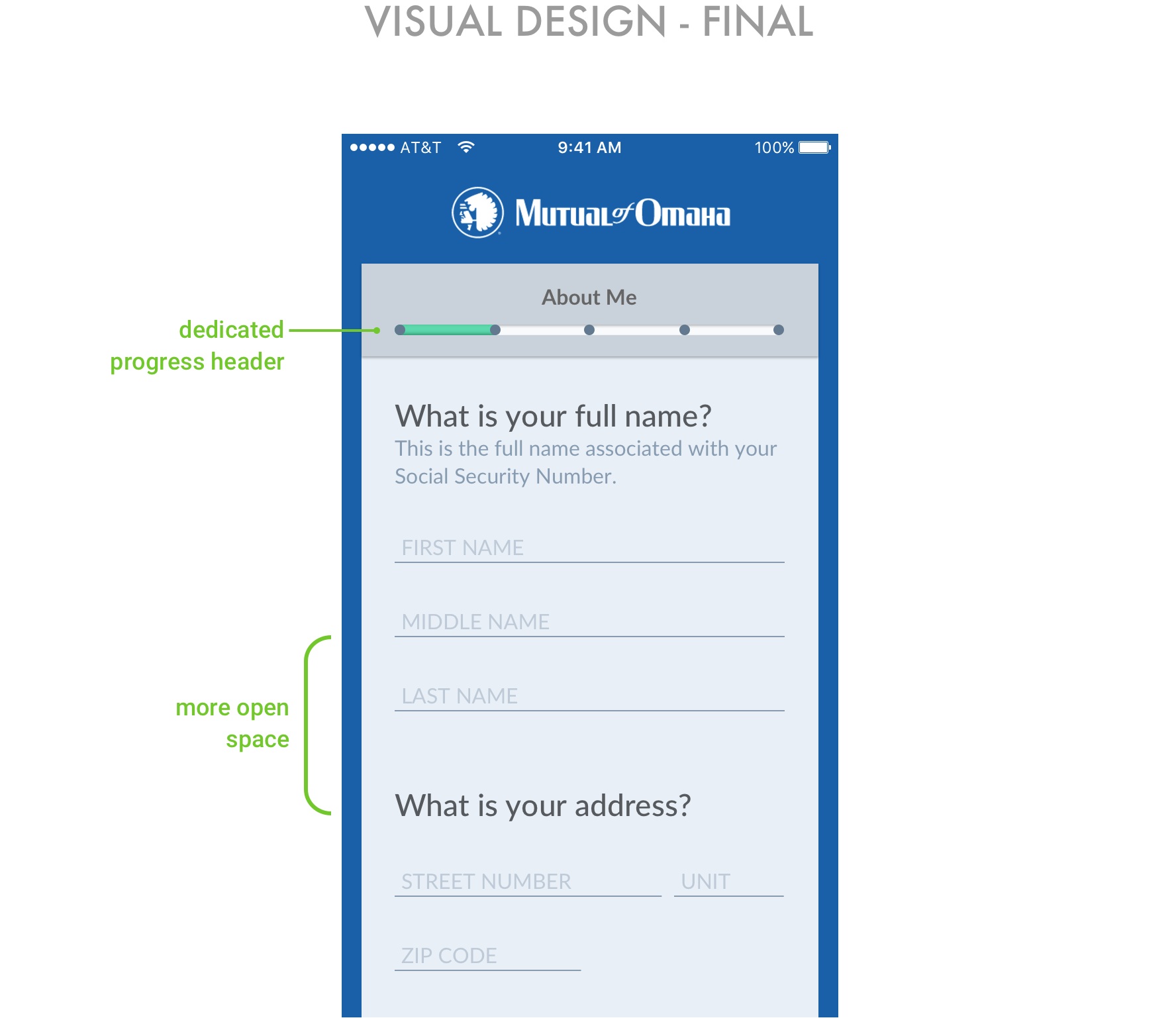
Solution
The final solution implemented several strategies to make the application as frictionless as possible, while also facilitaing the accuracy needed by the business.
Interactions
I created vignettes in Principle to illustrate each of the several micro-interactions designed to make the experience more intuitive and less intrusive.
Form automatically advances field focus once user enters data. Adjacent fields are dimmed.
Header and progress bar contract as user scrolls to increase size of working area
Slider with dynamically responsive values
Visual Design
I created a type scale hierarchy to work in sync with a solid layout for clean extensible spacing across all implementations and platforms.
Typography scale specification
Mobile layout with 6 columns and 14 px gutter height
Conclusion
This was an end to end project - from need-finding to specifications for developers, and it was very rewarding to see the project evolve.
What I learned
Working closely with a team, and showing ideas early saves a ton of time.
The power of copy and content strategy in shaping the voice of a product.
The role of form design in soliciting truthful responses
What I would do differently
While low fidelity is ok, including all functions in a prototype will solicit more solid feedback.
Do a pilot introduction with each usability testing participant.
Startups pivot. Stay light and loose.